
A little more than two years ago, in my beautiful college library in central London, I encountered a scholarly book called God and Enchantment of Place: Reclaiming Human Experience by Scottish theologian David Brown, currently Professor Emeritus at the School of Divinity at the University of St. Andrews. For the past decade or so, Brown has been committed to researching and writing about the way religion influences – and is influenced by – the arts and wider culture in general. His work is largely concerned with Christianity but regularly includes discussions of other faiths – Judaism, Islam, Hinduism, Buddhism, everything.

God and Enchantment of Place is a wide-ranging and dense study of how humans find mystery and meaning in place, how they have had the Divine “mediated” to them through landscape, flora and fauna, architecture, painting and festivals over the centuries. The reader will find a lot here – Greco-Roman temples and cities, Orthodox iconography, the Renaissance, house and garden arrangements of modern Chinese feng shui, much more.
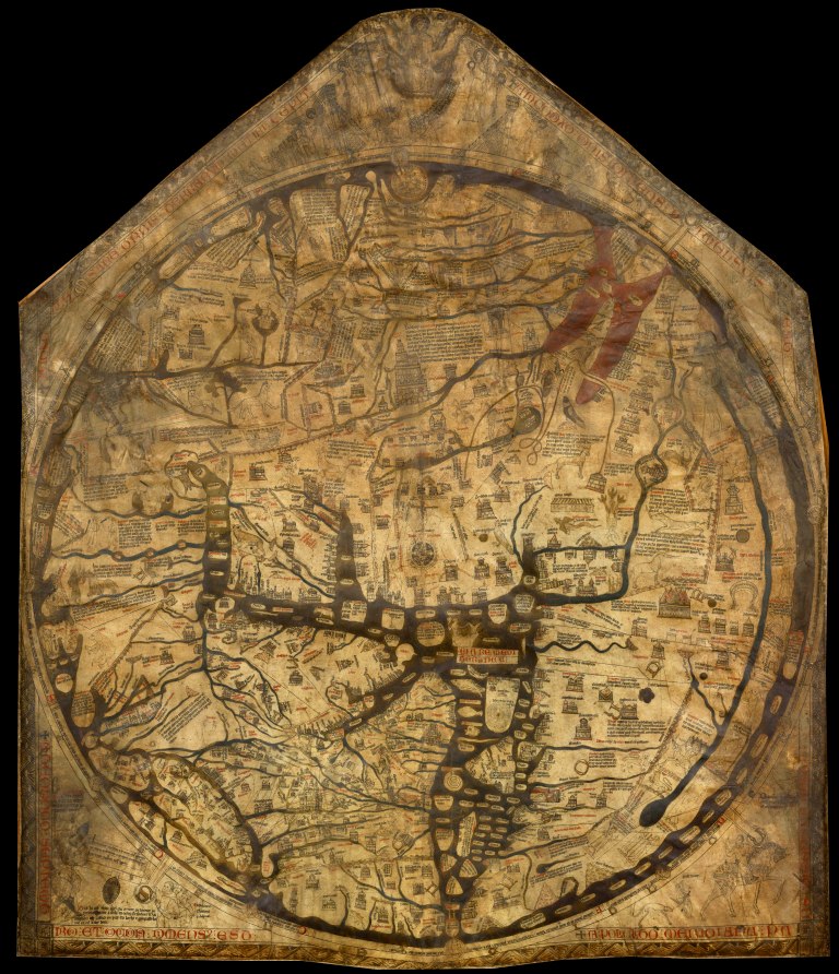
As I turned the pages, the one topic that stood out for me was “Jerusalem and Symbolic Geography” in a chapter called “Placement and Pilgrimage”. Historically, religious faith has impressed upon the minds of believers visions of certain “subjective” topographical arrangements that have had little to do with plain “objective” secular geography. For Christian Europe of 13th and 14th centuries, the spiritual centre of the world was the city of Jerusalem – it was also the geographical centre of their maps. A good example is the Hereford Mappa Mundi, displayed today at Hereford cathedral in the county of Herefordshire in western England.
![]()
Now, many of us moderns may find such “subjectivity” informed by medieval faith naive. At best, cute. But David Brown challenges the reader with a provocative observation. He says:
If the modern secularist is inclined to scoff, one possible response might be to note that our modern maps are not quite so far removed from such attitudes as may initially appear. One need only think of the way in which British maps used to be so structured as to emphasise the scale of the British empire (usually painted red, and with Britain at the centre), or even today the arbitrary convention that places the northern hemisphere at the top of our maps, as though places places like Europe and the United States were necessarily more important than Africa or South America. Such practices aided particular political perceptions of the world, and indeed for some may have made them intuitive or second-nature. That does not make them automatically correct, but equally it does not of itself invalidate the experience; similarly, then, with Jerusalem experienced sacramentally. God may be the objective correlate in one case, as are forms of political power and influence in the other. A measure was given which required one to interpret one’s local context against the canon of the central image. Of course it ‘slanted’ how experience was then read, but so too did the modern secular analogue of painting the map red. The ultimate objectivity of the referent of either experience cannot thus of itself be undermined by acknowledgment of this fact.
Two maps of the British empire that I have found:


Here is a recent world map – our “correct” map – made up of images from CIA and NASA. It isn’t grandly imperialistic but it retains Britain’s central position and the north-south division that continues to project some continents and countries as more important than others. We are used to it, we depend on it – but we must remember that, at the end of the day, it remains committed to advancing particular power structures and political ideologies – and this has profound psychological consequences across populations.

![]()
I leave you with a clip from the American TV series The West Wing (season 2, episode 16) that features a fictitious “Organization of Cartographers for Social Equality” and playfully questions our conceptions of “north” and “south”:
—-
![]()

Wonderful.
LikeLiked by 1 person
One only has to look at how confusing it is to our minds when north is not at the top to realise how much we now take it for granted.
LikeLiked by 1 person
Truly…
Very disorienting.
I loved that West Wing episode.
LikeLiked by 1 person
LikeLiked by 1 person
…and there are the likes of Ortelius and Mercator to think about too and their rather unique humanistic beliefs
LikeLike
Just found this…unique –
http://mentalfloss.com/article/88138/more-accurate-world-map-wins-prestigious-japanese-design-award
LikeLiked by 1 person
I am a bit torn because I have actually seen some of Mercator’s original work in Antwerp
LikeLiked by 1 person
I would love to see!
LikeLiked by 1 person